
Cómo crear una animación con Angular, Signals, CSS y SVG
Cómo crear una animación de like en Angular con Signals, CSS y SVG, sin librerías pesadas. El mismo corazón de esta web, con el código explicado paso a paso.
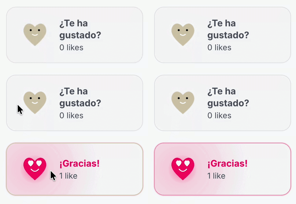
Vamos a montar una micro-interacción para dar like al contenido. Un corazón SVG que cambia de cara, hace un rebote y lanza partículas. Todo con Angular moderno (standalone + signals) y CSS, sin librerías externas.
Concretamente, vamos a hacer el botón de like que tenemos en esta web.
Por qué Signals + CSS y no usar una librería
Soy de los partidarios de que cuantas menos dependencias usemos en nuestros proyectos, mejor — ya sea por seguridad o por peso de la aplicación. Si algo lo podemos hacer nosotros, mucho mejor; y en este caso, si es solo un botón… con CSS es suficiente y suele ser mucho más ligero.
Parte | Quién la hace |
|---|---|
¿Está liked? ¿Está animando? | Signals en TypeScript |
Rebote, glow, partículas | CSS keyframes |
Cambio de cara | Clases + transitions |
Paso 1 — El componente con Signals
Creamos un standalone component. El estado lo guardamos en signals:
import { ChangeDetectionStrategy, Component, signal } from '@angular/core';

@Component({
  selector: 'app-like-button',
  standalone: true,
  templateUrl: './like-button.html',
  styleUrl: './like-button.scss',
  changeDetection: ChangeDetectionStrategy.OnPush,
  host: { class: 'like' },
})
export class LikeButton {
  readonly isLiked = signal(false);
  readonly isAnimating = signal(false);
  readonly showBurst = signal(false);

  giveLike(): void {
    if (this.isLiked()) {
      return; // un solo like
    }

    this.isLiked.set(true);
    this.playAnimation();
  }

  private playAnimation(): void {
    if (window.matchMedia('(prefers-reduced-motion: reduce)').matches) {
      return;
    }

    this.isAnimating.set(true);
    this.showBurst.set(true);

    setTimeout(() => this.isAnimating.set(false), 900);
    setTimeout(() => this.showBurst.set(false), 1000);
  }
}
Qué importa aquí:
isLiked→ estado permanente (liked / no liked)isAnimating→ dispara el rebote (clase temporal)showBurst→ monta las partículas solo mientras hacen falta
Con OnPush + signals, Angular actualiza solo lo necesario.
Paso 2 — SVG en la plantilla (y dos caras a la vez)
Importante: no destruyas la cara con @if. Si montas y desmontas el SVG, el cambio es brusco. Mejor deja las dos caras en el DOM y haz cross fade con CSS:
<button
  type="button"
  class="like__btn"
  [class.like__btn--liked]="isLiked()"
  [class.like__btn--animating]="isAnimating()"
  [attr.aria-pressed]="isLiked()"
  (click)="giveLike()"
>
  <svg viewBox="0 0 100 100" class="like__icon" aria-hidden="true">
    <path
      class="like__heart"
      d="M 50 85 C 20 60, 5 40, 20 20 C 35 5, 50 25, 50 25 C 50 25, 65 5, 80 20 C 95 40, 80 60, 50 85 Z"
    />

    <!-- Cara en reposo -->
    <g class="like__face like__face--calm">
      <circle cx="37" cy="35" r="3" fill="#fff" />
      <circle cx="63" cy="35" r="3" fill="#fff" />
      <path
        d="M 42 48 Q 50 55 58 48"
        fill="none"
        stroke="#fff"
        stroke-width="3"
        stroke-linecap="round"
      />
    </g>

    <!-- Cara feliz (ojos corazón) -->
    <g class="like__face like__face--happy">
      <path
        fill="#fff"
        d="M 37 42 C 28 34, 26 28, 31 24 C 34 21, 37 24, 37 24 C 37 24, 40 21, 43 24 C 48 28, 46 34, 37 42 Z"
      />
      <path
        fill="#fff"
        d="M 63 42 C 54 34, 52 28, 57 24 C 60 21, 63 24, 63 24 C 63 24, 66 21, 69 24 C 74 28, 72 34, 63 42 Z"
      />
      <path
        d="M 38 50 Q 50 64 62 50"
        fill="none"
        stroke="#fff"
        stroke-width="3"
        stroke-linecap="round"
      />
    </g>
  </svg>

  @if (showBurst()) {
    <span class="like__burst">
      @for (i of [0, 1, 2, 3, 4, 5]; track i) {
        <span class="like__particle" [style.--i]="i"></span>
      }
    </span>
  }
</button>
Angular es una maravilla para estas cosas: añades clases y estilos al SVG igual que en HTML normal.
Paso 3 — CSS: spring, caras y rebote
Dos curvas que ayudan mucho:
$spring: cubic-bezier(0.34, 1.56, 0.64, 1); // overshoot
$soft-out: cubic-bezier(0.22, 1, 0.36, 1);
Corazón y caras
.like__heart {
  fill: #c4c4c4;
  transition: fill 0.4s $soft-out;
}

.like__btn--liked .like__heart {
  fill: #ff0066;
}

.like__face {
  transition:
    opacity 0.28s $soft-out,
    transform 0.45s $spring;
}

.like__face--happy {
  opacity: 0;
  transform: scale(0.35);
}

.like__btn--liked .like__face--calm {
  opacity: 0;
}

.like__btn--liked .like__face--happy {
  opacity: 1;
  transform: scale(1);
}
Rebote al hacer like
Cuando isAnimating() es true, añadimos --animating y disparamos keyframes:
.like__btn--animating .like__icon {
  animation: like-pop 0.9s $spring both;
}

@keyframes like-pop {
  0%   { transform: scale(1) rotate(0deg); }
  12%  { transform: scale(0.72) rotate(4deg); }
  38%  { transform: scale(1.28) rotate(-10deg); }
  58%  { transform: scale(0.94) rotate(3deg); }
  100% { transform: scale(1.06) rotate(-3deg); }
}
Ese “squash → stretch → settle” es lo que da sensación de física sin librería.
Paso 4 — Partículas con distinta física
En vez de 6 puntos iguales, define perfiles distintos (float, arc, spin) y pásalos como CSS variables desde Angular:
readonly particles = [
  { id: 0, physics: 'float', angle: -18, delay: 0, distance: 1.9 },
  { id: 1, physics: 'spin', angle: 28, delay: 40, distance: 1.55 },
  { id: 2, physics: 'arc', angle: -52, delay: 70, distance: 1.7 },
];
@for (p of particles; track p.id) {
  <span
    class="like__particle"
    [class.like__particle--float]="p.physics === 'float'"
    [class.like__particle--arc]="p.physics === 'arc'"
    [class.like__particle--spin]="p.physics === 'spin'"
    [style.--angle.deg]="p.angle"
    [style.--delay.ms]="p.delay"
    [style.--distance.rem]="p.distance"
  ></span>
}
.like__particle {
  position: absolute;
  top: 50%;
  left: 50%;
  width: 0.35rem;
  height: 0.35rem;
  border-radius: 50%;
  background: #ffd600;
  opacity: 0;
}

.like__particle--float {
  animation: particle-float 0.85s ease-out var(--delay) forwards;
}

@keyframes particle-float {
  0% {
    opacity: 0;
    transform: translate(-50%, -50%) rotate(var(--angle)) translateY(0) scale(0.2);
  }
  15% { opacity: 1; }
  100% {
    opacity: 0;
    transform: translate(-50%, -50%) rotate(var(--angle))
      translateY(calc(var(--distance) * -1)) scale(0.2);
  }
}
Para arc y spin, cambia solo el keyframe (arco con “gravedad”, giro mientras viajan). El HTML no cambia.
Paso 5 — Idle y hover
Pequeños detalles que dan vida:
/* Latido suave en reposo */
.like__btn:not(.like__btn--liked) .like__heart {
  animation: idle-beat 3.2s ease infinite;
}

@keyframes idle-beat {
  0%, 72%, 100% { transform: scale(1); }
  78% { transform: scale(1.07); }
  84% { transform: scale(0.97); }
}
En hover puedes guiñar un ojo (ocultar un círculo y mostrar un path de guiño).
Paso 6 — Accesibilidad
@media (prefers-reduced-motion: reduce) {
  .like__btn--animating .like__icon,
  .like__particle {
    animation: none;
  }
}
En TypeScript, si detectas reduced motion, no actives isAnimating / showBurst.